Branding for an up-and-coming dance and events company.
AJT Events is a dynamic dance event coordination company that provides a platform for local performers to showcase their talents. When tasked with redefining their brand identity, I set out to create a look that was both elegant and versatile, allowing it to complement any style of dance.
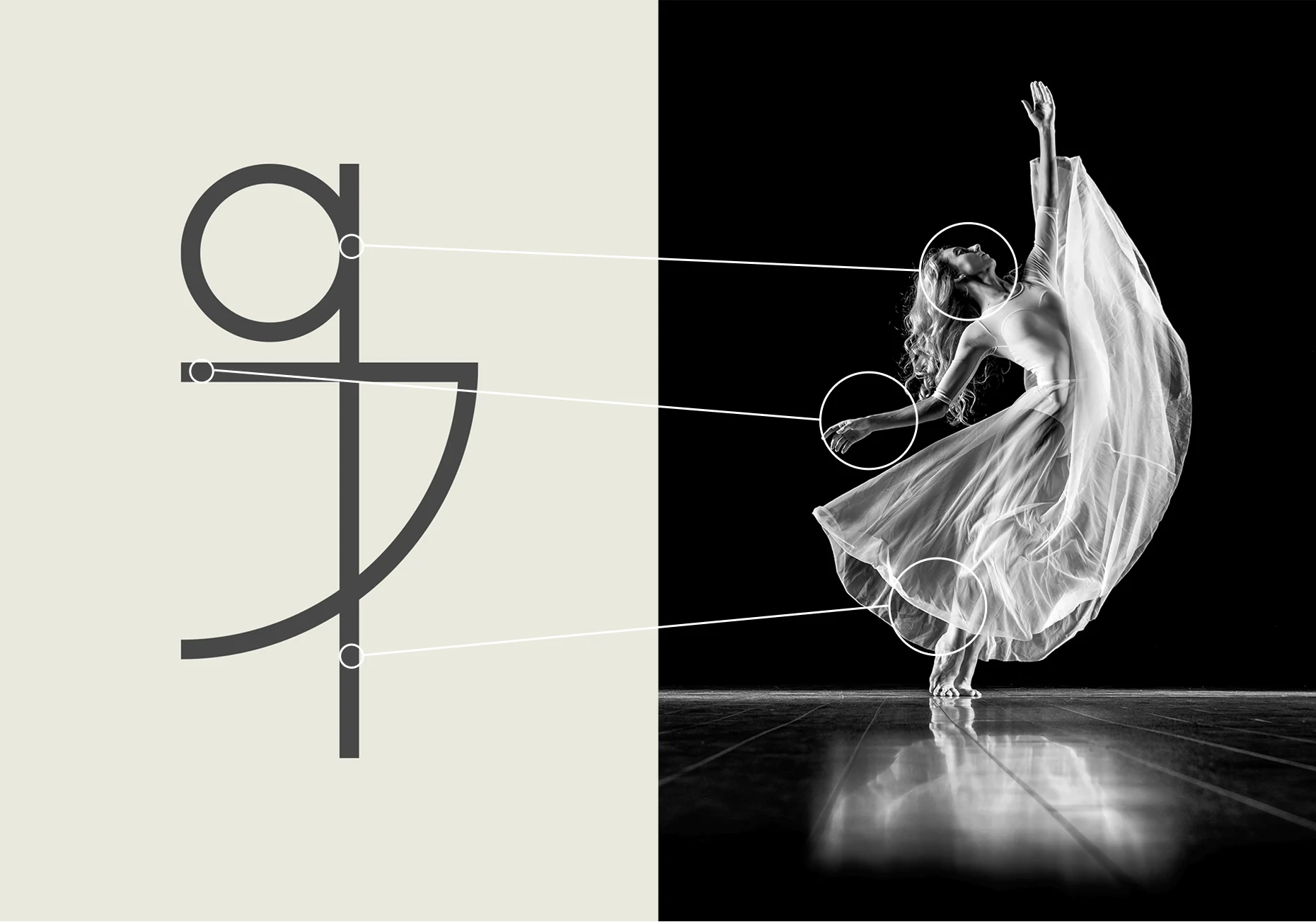
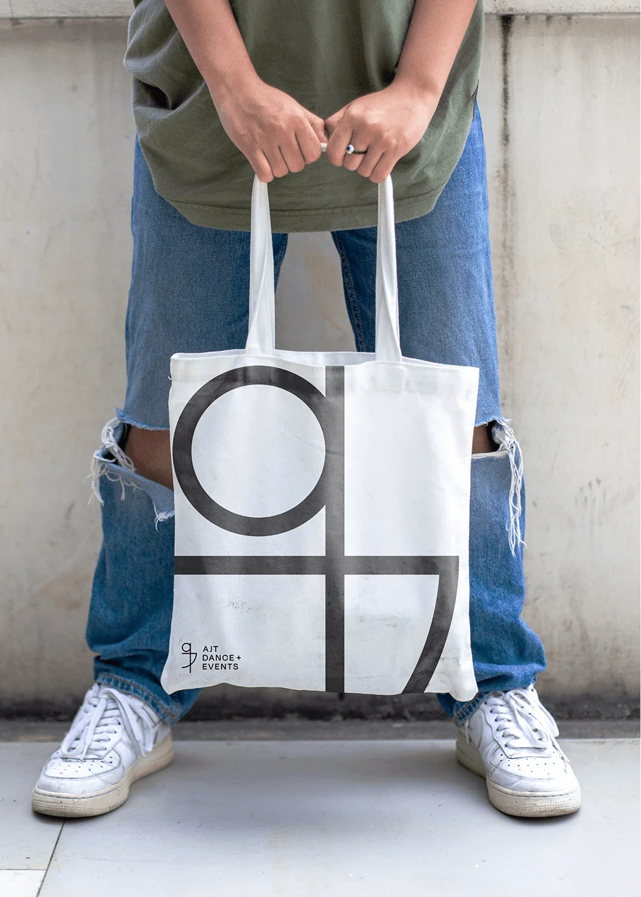
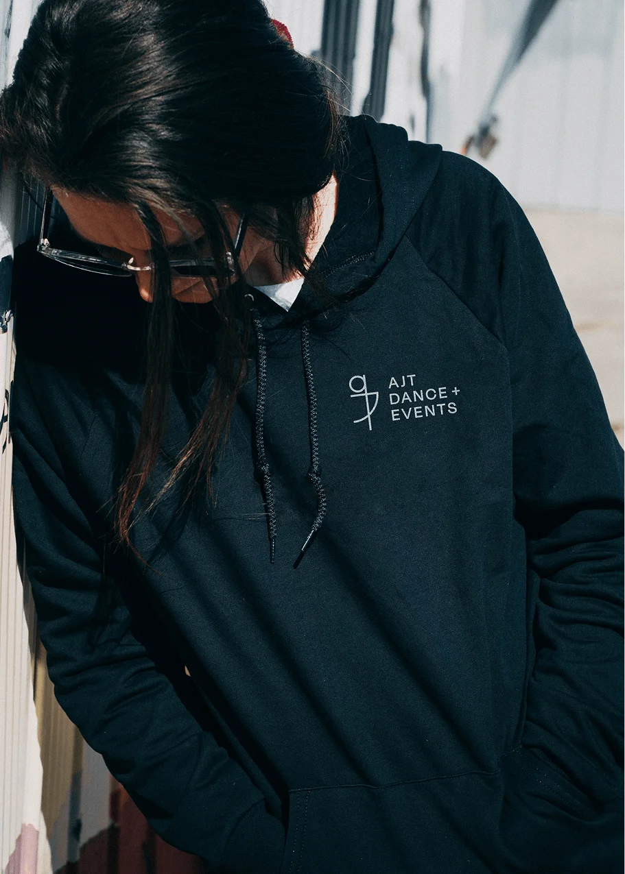
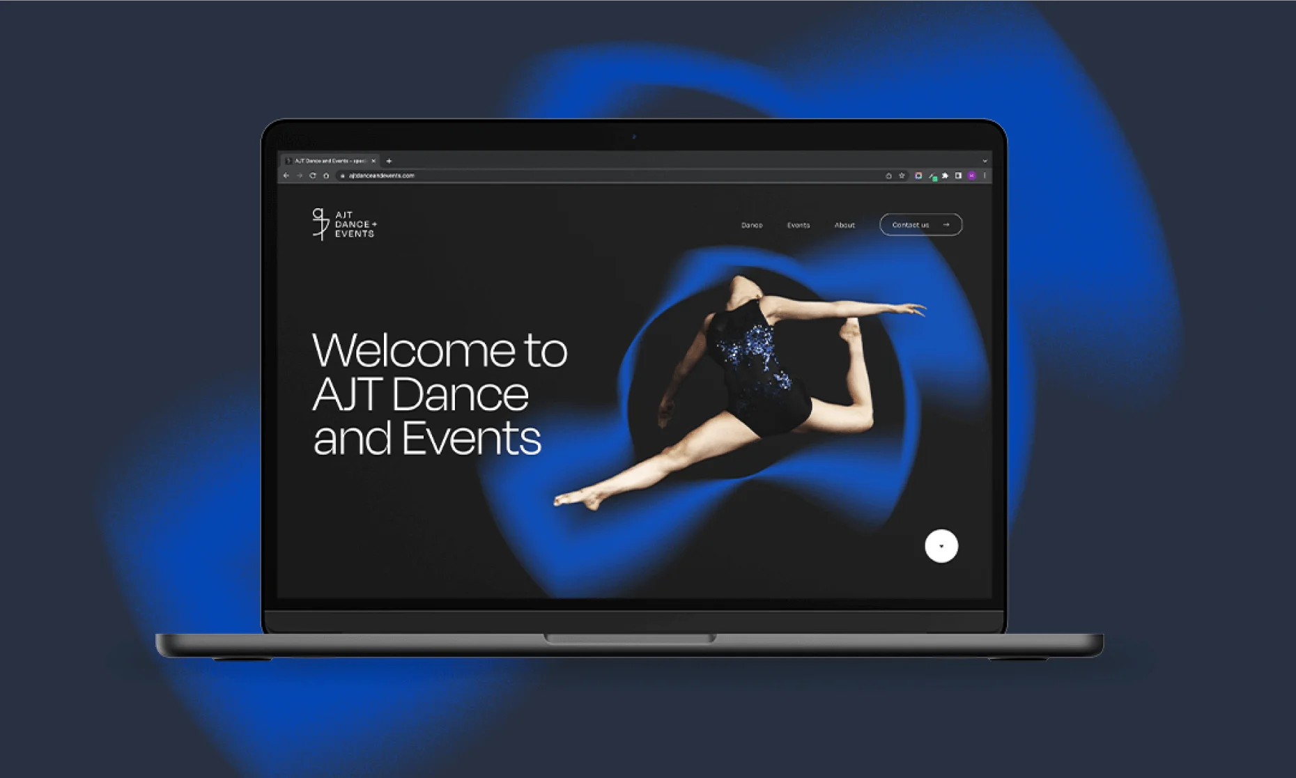
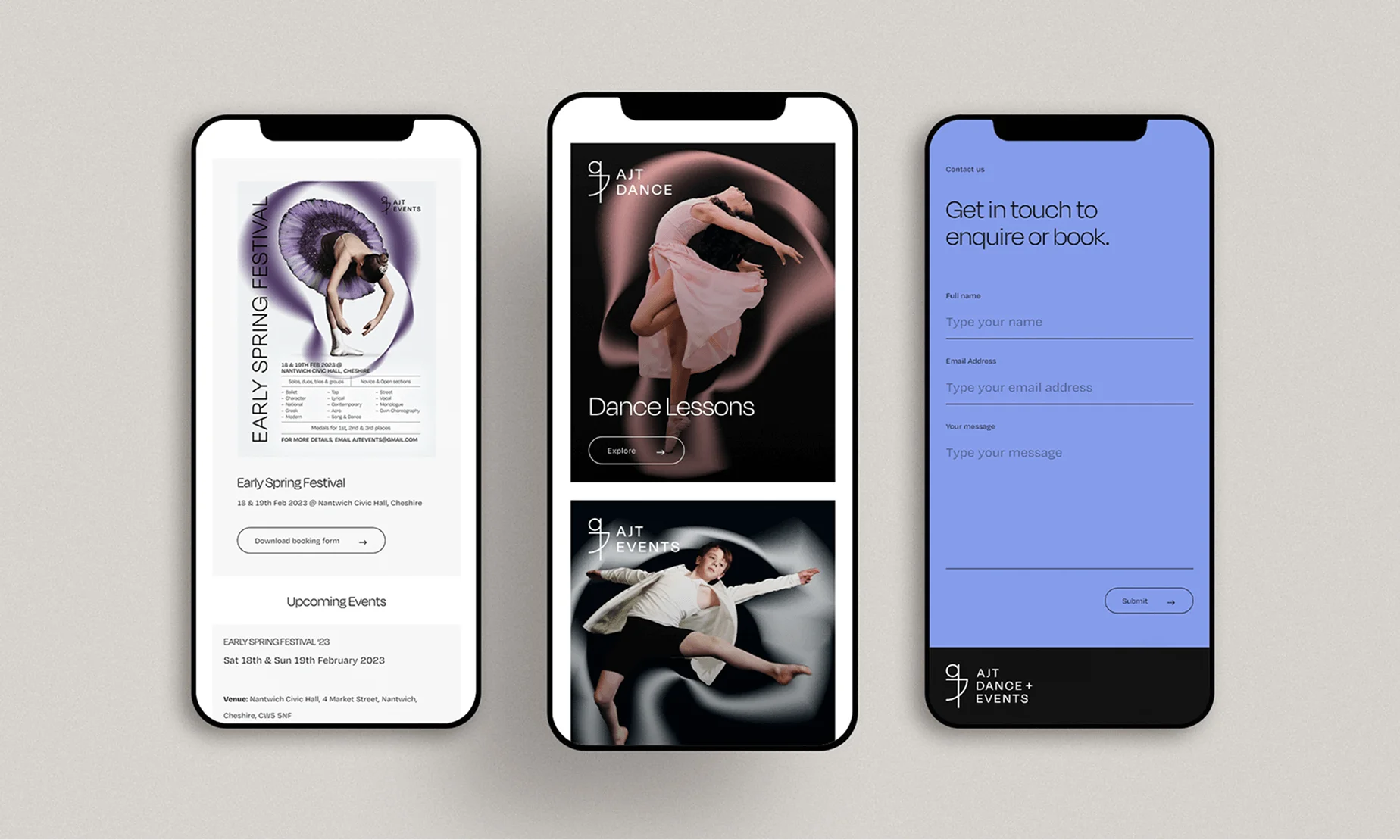
At the heart of the rebrand was a new logo—a refined yet expressive mark that cleverly integrates the letters ‘ajt’ into the silhouette of a dancer. This subtle visual cue not only reinforces the company’s connection to dance but also adds an element of movement and fluidity, essential to the energy of their events. The thin-line aesthetic of the logo was deliberately chosen to convey grace and precision, while the accompanying sophisticated sans-serif typeface introduced a contemporary edge. This balance between fluidity and structure set the foundation for the wider identity.
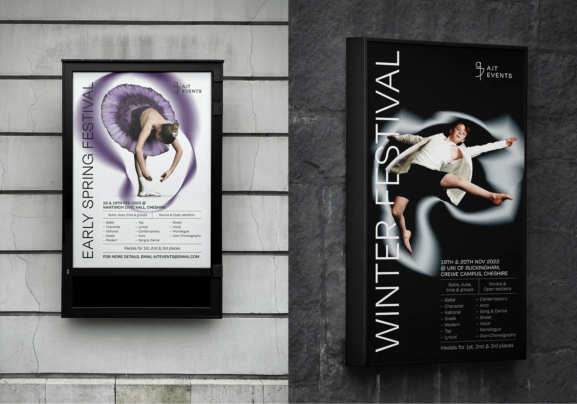
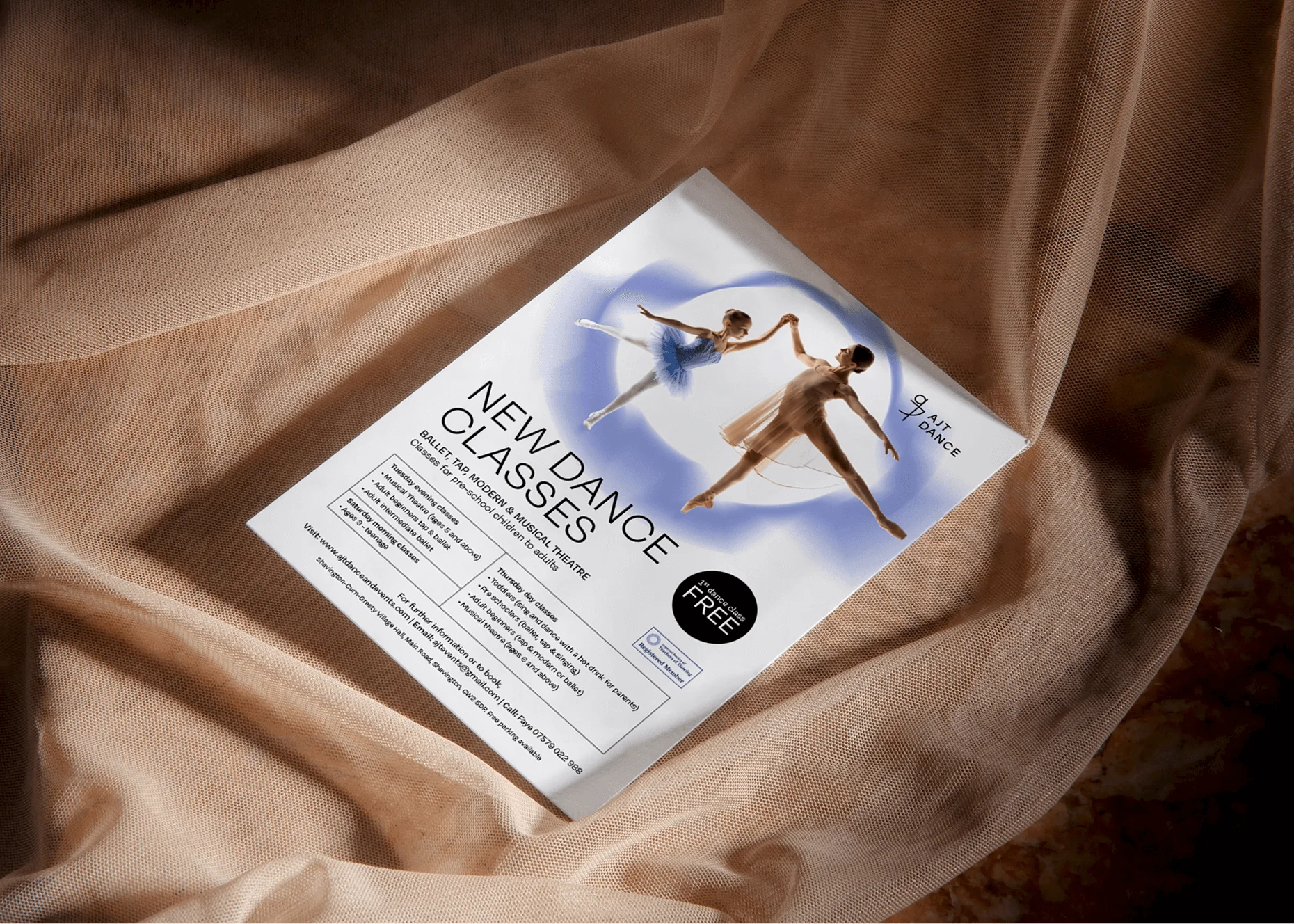
In designing the full brand system, I was mindful of keeping the imagery as the hero. Dance is inherently visual, and I didn’t want the brand elements to overshadow the performers themselves. To achieve this, I adopted a clean and contemporary approach, allowing the typography to integrate seamlessly within the negative space of images rather than dominating them. This created a natural, editorial feel, ensuring that the brand felt aspirational yet accessible.
The core colour palette was intentionally restrained, focusing on grayscale tones—predominantly pure black and white. This choice was inspired by the theatrical lighting and dark backdrops of dance stages, ensuring that the branding felt at home within the event environment. Any additional colour came exclusively from the dancers’ outfits, reinforcing the idea that the performers are the focal point of every design. This approach allowed each promotional material—whether digital or print—to feel immersive and true to the art of dance.
The final result was a sophisticated, flexible identity that gives AJT Events a professional yet emotive presence, one that can adapt to any dance genre while maintaining a strong, recognisable brand. The rebrand not only set the stage for the company’s growth but also ensured that every event they coordinate carries a distinct visual elegance, perfectly framing the talent it showcases.